2019 Pantone colours: the first palettes unveiled!
We have reached the mid-point of a 2018 which, in terms of colours, has gifted designers and professionals a host of ideas and unexpected innovations. From the colours selected in the 2018 Pantone colour palettes, a trend has emerged of favouring the use of bright, lively colours, in both the fashion world and that of interior design, while in Ultra Violet, chosen as the colour of the year 2018, we found a very special colour with its face set firmly towards the future.
Update 6th December: Pantone color of the year is Living Coral! Find our more in the article!
But what is going to happen in the world of colour in 2019? Will there be a reversal of the trend? Pantone recently unveiled some of the palettes that will be included in the 2019 colours dedicated to design and interior design. Let’s take a closer look at which colours are involved.
The 2019 Pantone colours: here are the first 3 palettes unveiled
The 2019 Pantone colours for interior design are included in the annual publication PANTONEVIEW home + interiors 2019, a study that includes 72 colours for 2019 divided into 8 themes and accompanied by images to help find the right inspiration for combining them.
“Today there are countless solutions, so it is essential for brands and the designers of furniture and home furnishings to address the needs of their consumers and provide themes, ranges and colours that enhance the environment and are a source of inspiration, transcending the concept of surfaces,” says Laurie Pressman, Vice President of the Pantone Color Institute.
“The PANTONEVIEW home + interiors 2019 guide is inspired by the theme of careful attention: since the choices are endless you need to focus on those colours that have the ability to catch the eye. The Pantone guide is a journey through those colours that open up a different future, a journey that leaves more room for imagination”.
In the 3 selections released so far by the American company there is one palette dedicated to the colours of food, one dedicated to the evergreens of colour and one shaped by the theme of multiculturalism.
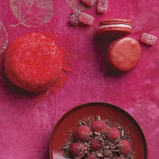
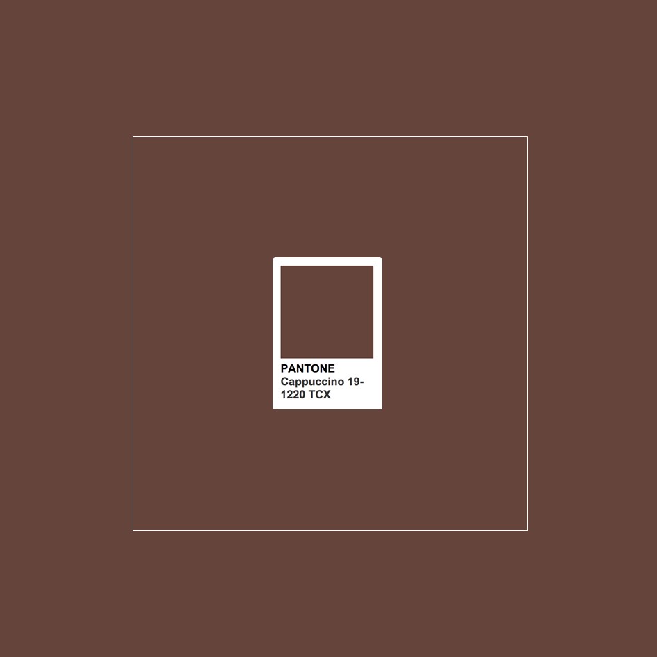
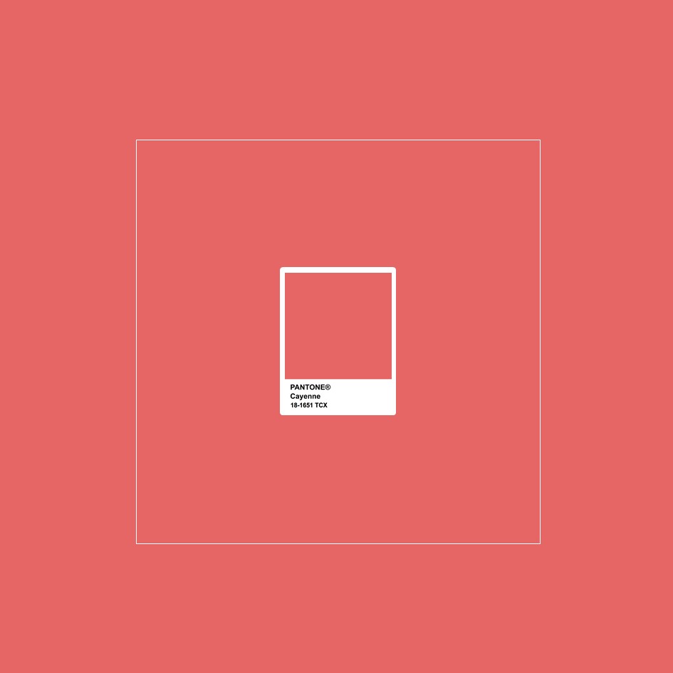
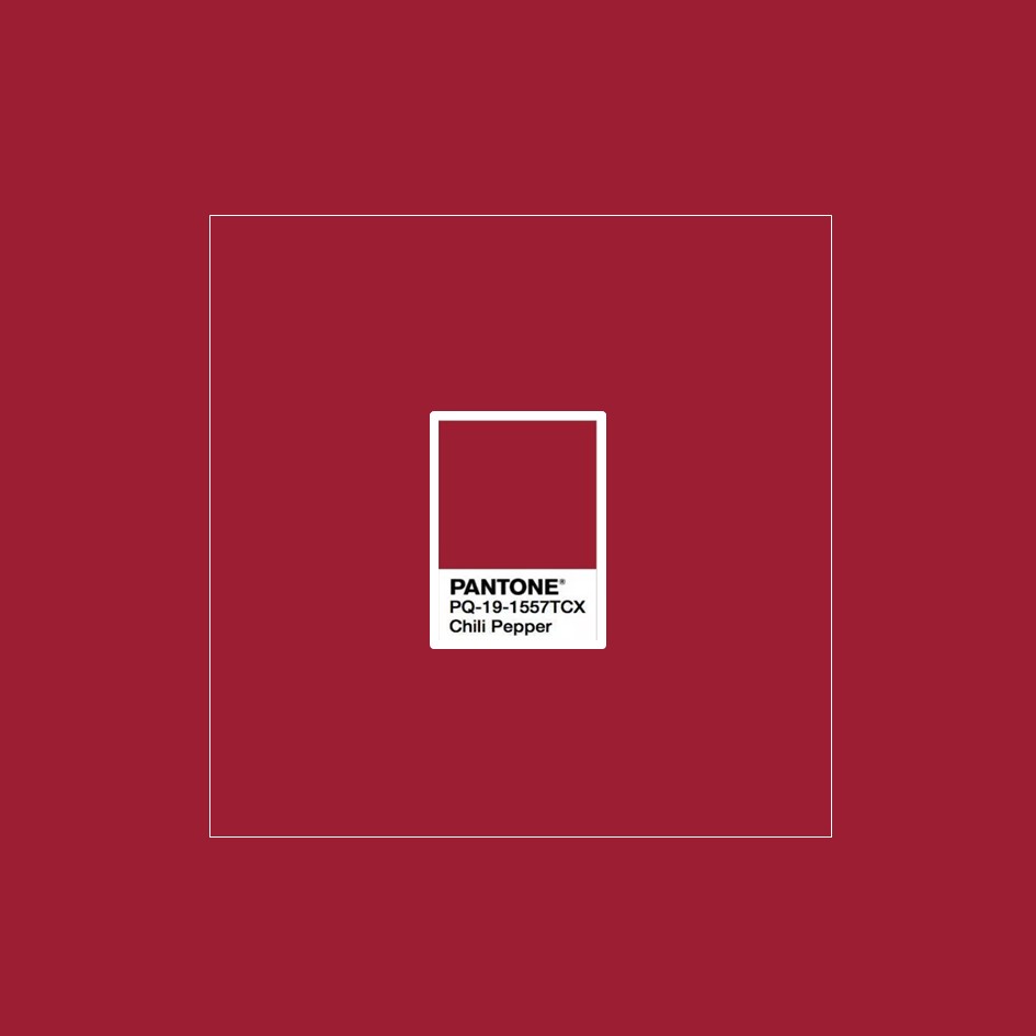
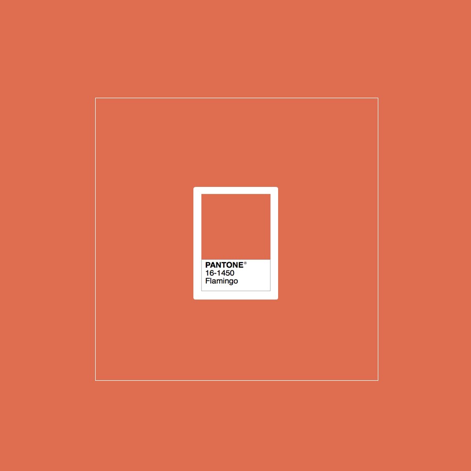
Cravings, the 2019 Pantone palette dedicated to food
The name of this Palette is emblematic and leaves one to conclude that its origins are based on senses stimulated by food. Cravings carries the sense of longing or desire and the palette incorporates colours that conjure up the temptation that is aroused on seeing a mouth-watering dish, a tasty dessert: the reds of oriental spices, and delicate pinks and violets are alternated with colder tones like the green of the meadow, which enriches the palette.

Among the colours included in Cravings – Pantone Colour Palette 2019 we find: Butterum, Cappuccino, Chili Pepper, Flamingo, Grass Green, and Cayenne


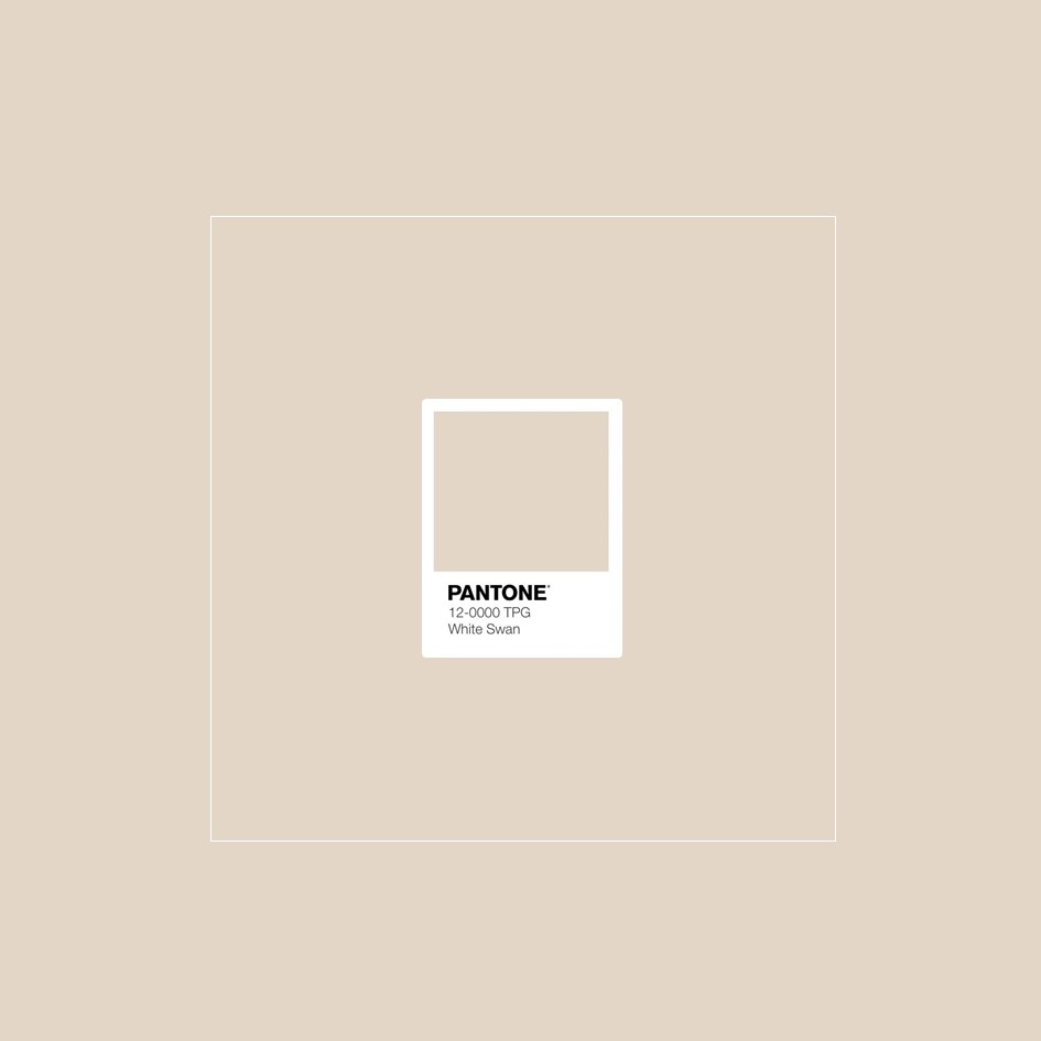
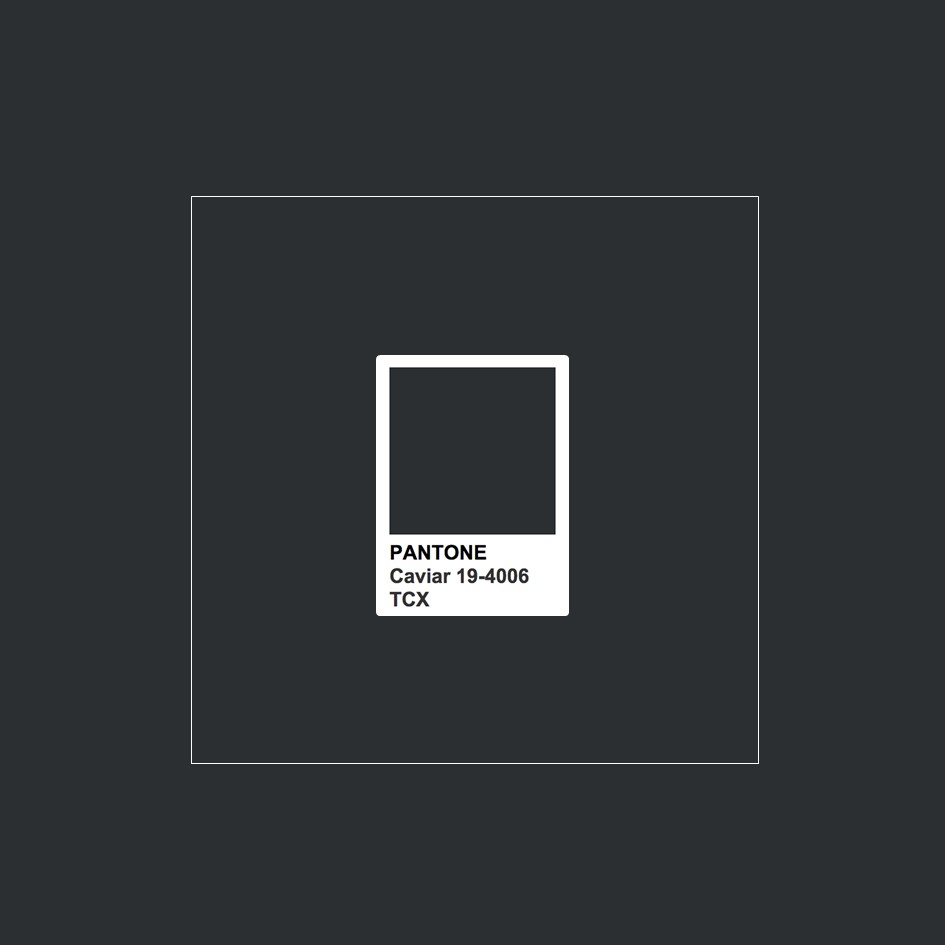
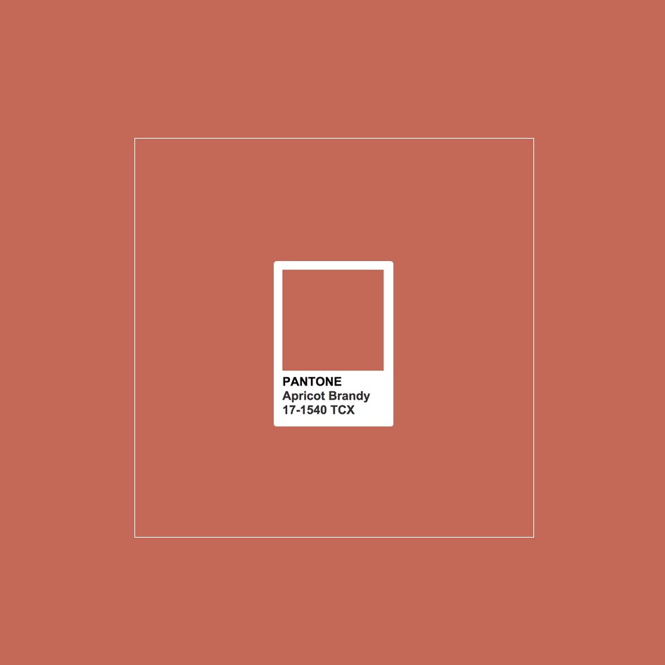
Classico, the 2019 Pantone palette of timeless colours
Just as the name suggests, the shades of the Pantone Classico palette are essential, sober and timeless and at the same time, elegant and always in fashion.
It is a palette in which perfectly different shades coexist, from white to caramel, from grey to green to black and bordeaux and that can be adapted to different settings and furnishing styles.
Among the colours included in Classico – Pantone Colour Palette 2019 we find: Camel, Deep Teal, Apricot Brandy, Gray Flannel, White Swan, and Caviar


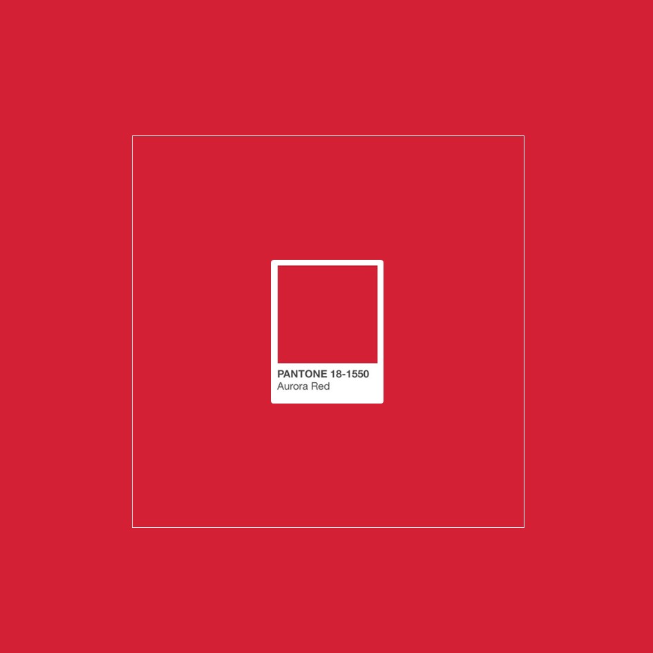
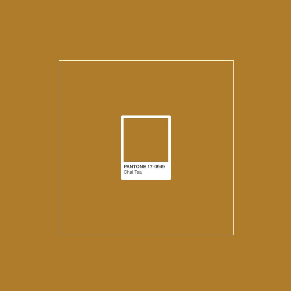
Meanderings, the 2019 Pantone palette of globalisation
For years, the phenomenon of globalisation and the constant movement of people and products have been significantly changing the habits and customs of populations all over the world. Pantone celebrates this development with a palette of “globalised” colour and “unpremeditated” aesthetics, an instinctive palette that reflects the colours of elements of our world.
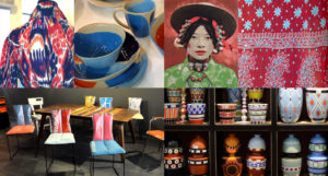
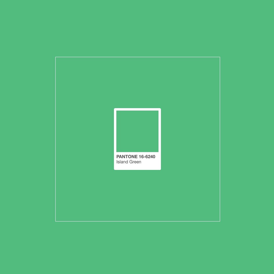
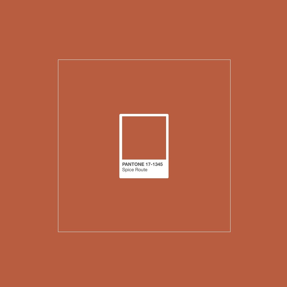
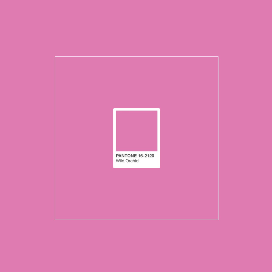
This chromatic mood in the world of furnishing and interior design is a story of colours that Pantone has called Meanderings, and that tells of travel, sensations, cultures and diversity. Among the colours included in Meanderings – Pantone Colour Palette 2019 are: Island Green, Blue Print, Spice Route, Chai Tea, Aurora Red and Wild Orchid.


Over the coming weeks we will continue to unveil the other 5 Pantone colour palettes for 2019. There is still time to become familiar with the colours of 2019 and to understand how to apply them in the world of design … meanwhile, what do you think of this first selection?
Tell us what you think and follow us on social media. You can find us on Facebook, Instagram, LinkedIn, Pinterest and YouTube!
- 0 Comment